
The NHL Logos Ranked: (10-1)

nhltraderumor.com
In my opinion, the NHL has some of the best logos in professional sports. Some are iconic, some are just awesome looking, and some are both. I decided to rank all 31 teams’ primary logo from worst to first in three segments and this is the final one revealing the league’s top ten logos. To view the first two segments, click the links below. Let’s get started:
10. San Jose Sharks

1000logos.net
I mean, this logo is awesome. Awesome enough to knock the Canadiens out of the top 10. The shark looks very fierce and menacing and I love how it’s biting right through the hockey stick, breaking it in half. A lot of times animal logos are either too basic or too extravagant, but this one is done just right.
9. Philadelphia Flyers

1000logos.net
This logo has never changed throughout Flyer history and why should it? The simple, yet very effective Flyer P is very smooth-looking. Possibly the one thing I like about it most is the color scheme. Several professional teams use orange as a primary color, but nobody uses this shade of orange. Combined with the black, it’s a very sharp-looking color scheme.
8. St. Louis Blues

1000logos.net
A lot of people probably wouldn’t rank the Blues logo this high, but I love it. And I don’t even like the team. But I’ve always been a big fan of the “simple, but effective” logos, as I like to put it, and this is definitely one of them. Representing the blues music scene in St. Louis, the musical note with wings is a very cool and great-looking way to do that. And the bright blue highlighted by the yellow looks great as well.
7. New York Islanders

1000logos.net
The first of the two New York City hockey teams, the Islanders have a classic logo that really stands out. The blue and orange (same as the New York Mets) colors works really well together, creating a vivid contrast that just jumps out at you. The way they incorporated the hockey stick as the “Y” is cool, as is the orange Long Island in the middle.
6. Boston Bruins

1000logos.net
We’re getting into some really classic logos now. The Bruins logo is recognized worldwide and has been the same ever since 1949. As iconic and cool as it is, the older logos with the brown bear were even better. But these work too and have carved out the Boston hockey identity for years. The colors are classic as well. You can never go wrong with black and yellow.
5. New York Rangers

1000logos.net
Now, the second New York City team, the Rangers. Like their crosstown counterpart, the Rangers have an iconic logo that is even more instantly recognizable. One of the oldest hockey teams in the league, the Rangers have had the same logo since 1926. Red, white, and blue always work great together and it’s just such a classy logo overall. It’s like a badge that only the privileged get to wear.
4. Toronto Maple Leafs

1000logos.net
I love, love, love the classic “maple leaf” logo that Toronto has always used. The simple blue and white color scheme works perfect for this team and logo. It’s classic and classy. The leaf looks really good with the veins running through it too, so I’m glad they went back to that look four years ago for the first time since 1963. Everything about the logo just screams Canada and classic.
3. Pittsburgh Penguins

1000logos.net
We have a Penguin playing hockey, so I mean c’mon. This is such a cool-looking logo that is iconic, but fresh at the same time. The black and yellow colors are great, so much better than the black and tan colors they used from 2002 to 2015. This logo pretty much meets every dynamic that makes a logo great.
2. Detroit Red Wings

1000logos.net
Ever since 1932, the Red Wings have donned this iconic logo. It gives a great nod to its “Motor City” home with the bright red wheel with large red wings behind it. When you see this logo, you instantly make the connection with Detroit hockey. Their long, successful history with this logo just makes it even better. It’s one of the coolest logo in sports.
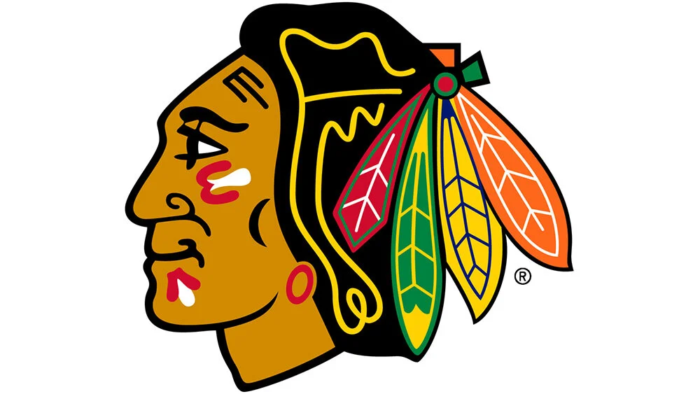
1. Chicago Blackhawks
1000logos.net
In my opinion, the Blackhawks have the best logo in sports. The Native American head is so awesome-looking for many reasons. For one, it involves so many colors. There’s 8-10 different colors combined with this logo to make it instantly jump out at you and grab your attention. But even with all the color, it’s not overwhelming and still looks very smooth. Another reason this logo is cool is because all the history tied to the franchise with this logo. They’ve used the Native American head ever since 1926 and the colors have been pretty much the same since the 1950s. This one is as classic and iconic as they come.
Garett