
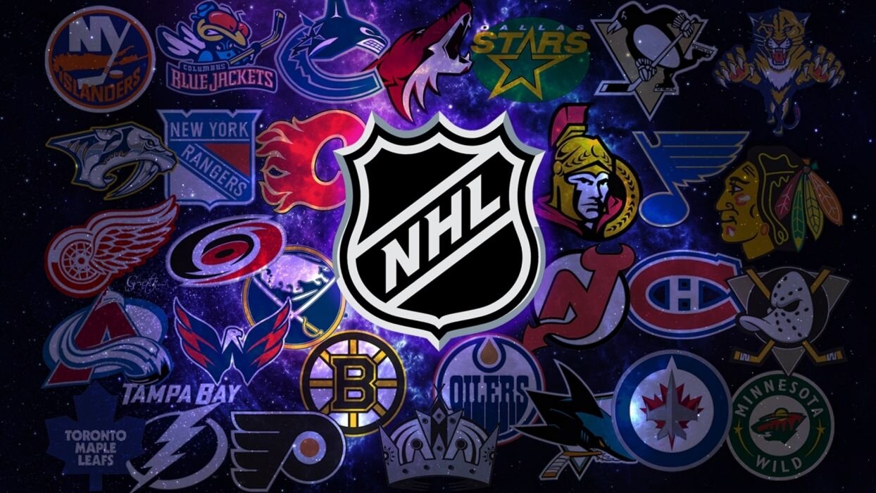
The NHL Logos Ranked: (31-21)
nhltraderumor.com
In my opinion, the NHL has some of the best logos in professional sports. Some are iconic, some are just awesome looking, and some are both. I decided to rank all 31 teams’ primary logo from worst to first in three segments, so this list will deal with the bottom 11 teams. With these 11 teams, some logos just aren’t very good and others are decent looking. Let’s get started:
31. Anaheim Ducks

1000logos.net
This franchise really messed up when they dropped the “Mighty” from their Ducks nickname. They used to have an awesome Mighty Ducks logo, but now they have the most plain and boring logo in the league. The logo, the colors, and everything about it is bland.
30. Columbus Blue Jackets

1000logos.net
Since the franchise began in 2000, the club has used two different logos prior to this one. Neither was that great, but they were better than this one, which is just the Ohio state flag wrapped around a star. With the Dallas franchise incorporating a star into it’s logo since their Minnesota days, this just feels like rip off of their logo.
29. Vegas Golden Knights

nhl.com
Perhaps it’s just because the franchise is still new and I haven’t gotten used to this logo yet, but I am not a fan of it. With a name like the Golden Knights, the opportunities to create an awesome logo were limitless. A knight riding a horse would have been really cool, but this just feels like the artist took the lazy way out.
28. Dallas Stars

1000logos.net
This logo is just too plain. The logo the Stars used from 1995 to 2013 was much better for the sole fact it incorporated gold into the color scheme. But this one doesn’t have a color to really make the logo “pop.” It doesn’t stand out at all, which is not a good thing.
27. Arizona Coyotes

1000logos.net
With the Coyote nickname, it should have been pretty easy to create a cool-looking logo. While this one isn’t atrocious, I certainly think they missed an opportunity. The coyote is just too simple-looking to be an iconic logo.
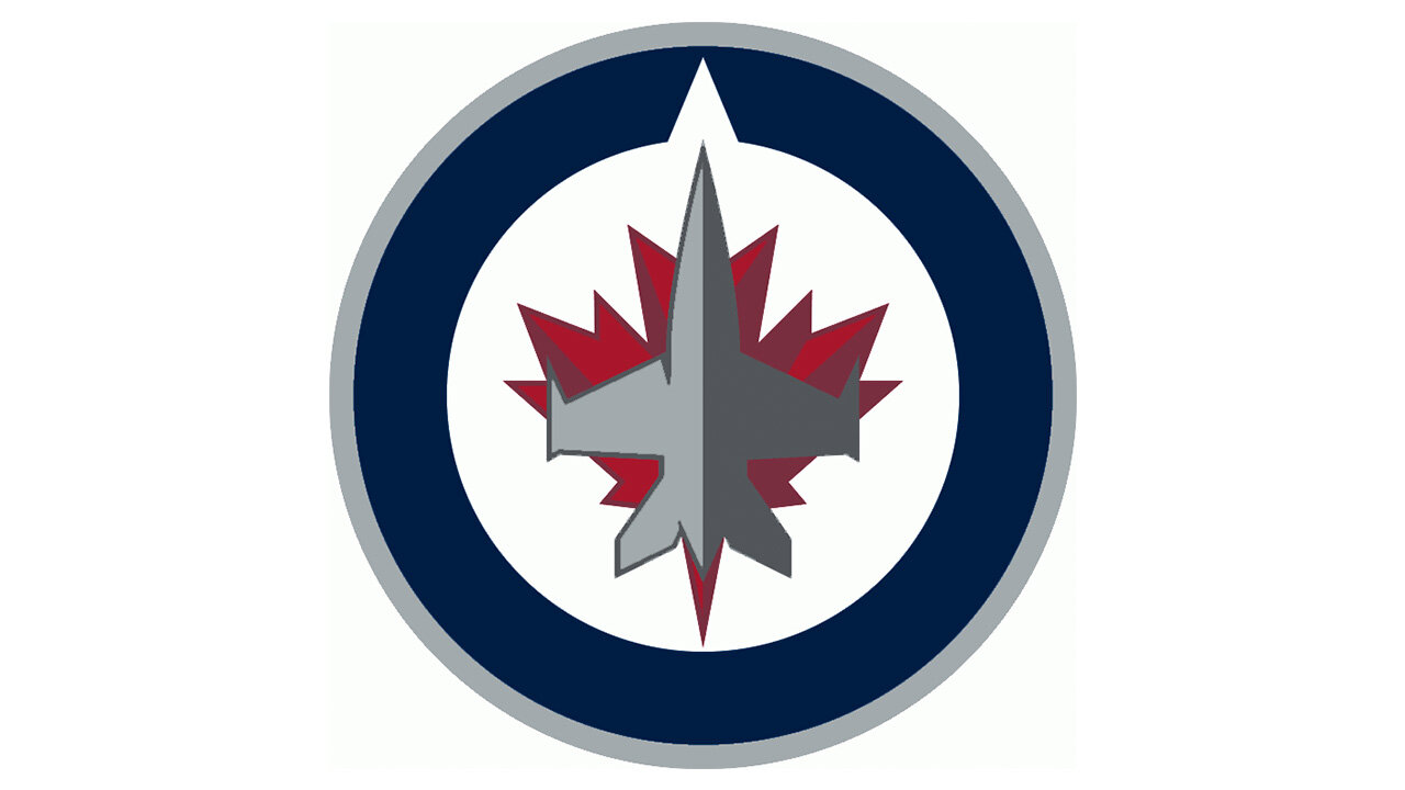
26. Winnipeg Jets
1000logos.net
This is the only logo the franchise has had since relocating from Atlanta in 2012. While I don’t hate this logo, it isn’t anything to brag about. The colors are pretty boring, for one thing. If it was up to me I would have chosen a lighter blue to contrast that dark red. That would have looked much better, but that’s just me.
25. Vancouver Canucks

1000logos.net
The Canucks have used this logo since 2008 of a whale jumping out of the water in the shape of a “C.” This is the part of this list where the logos aren’t bad, but they aren’t good. Like many other logos, the color scheme is the worst part of this one. Dark blue and black just doesn’t look good together when no other colors are incorporated. If they would throw their green in there, it would be much better.
24. Florida Panthers

1000logos.net
Something about this logo, used since 2016, just screams “Major League Soccer” to me. It’s definitely not a bad logo, and I like how it says “Florida” on top of the shield, but it’s not as good as their previous logo of the Panther jumping in attack mode towards you.
23. Calgary Flames

1000logos.net
This one is simple and a lot of times simple is good. Sometimes simple is great. In this case, I’d call it pretty decent. I like how they use a bright red and yellow because, 1: it’s different 2: that’s what a Flame logo should look like. Even though it’s simple, it still gets your attention.
22. Washington Capitals

1000logos.net
Many people may not agree with this, but after all, it is just their full name written out with a hockey stick substituted for a “t.” I like the blue and red, especially since they represent our nation’s capital, but it is a little on the plain side. The logo they used from 2003 to 2007 was very cool looking, except for its drab color scheme. If they had that one, with the current red and blue, it would be awesome.
21. Carolina Hurricanes

1000logos.net
The hockey team from our home state reps a red and black hurricane shape you see on the weather radar. It’s not a bad logo at all and it’s different, which is good. If you’re from the Midwest and don’t know what hurricanes look like on the weather radar, you might think this logo is just a jumbled up mess of red and black. But either way, it’s not a bad logo, it just didn’t quite crack our top 20.
Garett