
The Best-Looking Basketball Courts of the PAC-12 (Ranked from Worst to Best)

pac-12.com
I decided to begin a quest to determine which college basketball teams around the country have the best-looking courts. But first I’m going to break down each of the biggest conferences in college basketball before putting together a Top-10 “Best-Looking Courts in America” list. I decided to start with the PAC-12. From worst to first, I am ranking each court in the PAC-12 based on how “cool” their court is.
**Important**
These lists are determined ONLY on how cool I think the court design looks. I am NOT taking into consideration how historic and traditional certain teams and courts are, which would give the blue bloods an unfair advantage. I’m pretending I know nothing about each team and their history. Let’s get started.
12. Oregon Ducks

You either love it or you hate it, and I fall on the “hate” side. This court has been talked about more than any other college basketball court in the country since it was designed, for good and for bad. I know the shaded areas represent the region’s trees, and while it’s cool in theory, it just doesn’t look good as a finished product.
11. Washington Huskies

Personally, I don’t care much for Washington’s colors, so that puts them at a disadvantage in my ranking. But this court is just boring. Oregon had too much going for it and Washington doesn’t have enough.
10. Colorado Buffaloes

Like Washington’s court, I just think this court is pretty boring-looking. But, it’s not quite as boring. I think they need to mix in some gold with the black on the court and it would look a lot better. The buffalo design at mid-court is ok, but I don’t think the mountains design at the bottom of the court looks that great. They could’ve done a lot more with that.
9. Arizona State Sun Devils

Their court has a lot of potential, but I don’t think it lives up to it. Their colors are cool, but underutilized in this court design. And I’ve never been crazy about the pitchfork design, which they have a mid-court. If their logo was cooler, they would be bumped up a few notches.
8. Arizona Wildcats

Not a bad design. But it’s nothing special either. Their blue and red color combination is a good on and I think they utilized that well on their basketball court. It’s a classic design that they will probably never change, and that would be ok.
7. USC Trojans

I’ve always liked their two primary colors a lot. That dark red and yellow is a classic color design and it looks pretty good on their court. The yellow USC TROJANS on the baseline really stands out and looks good. And the interlocking S and C at the midcourt looks pretty classic. It’s a simple design that says quite a bit.
6. Stanford Cardinal

I feel like I have this higher on my list than a lot of people would, but I like it quite a bit and I can’t really describe why. Their shade of red is classic for a university and their S with a white tree in the middle of it looks really good at mid-court. Like USC’s, it’s simple, but gets the job done.
5. Oregon State Beavers

Orange and black always looks good together and for colleges and universities, it’s different. For whatever reason, you don’t see many orange and black colleges. And different is cool. I also like how they went with their beaver logo at mid-court instead of the letters OSU.
4. Utah Utes

This is the first of the two-tone hardwood courts and I love them all. So, any basketball court that has that will automatically be pretty high on these lists. The red and black colors look tough together, as you can see on their baseline, which I really like. Sometimes I don’t like a simple letter or two at mid-court, but for some reason, this U works for me. Pretty cool looking court.
3. UCLA Bruins
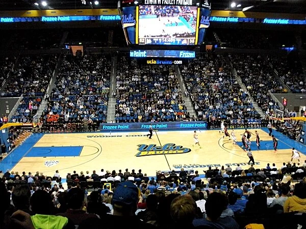
A lot of people will say this court is the best simply because of the UCLA tradition. But remember, I’m not basing any of this off of a teams history and tradition. With that being said, I still do really like this court. I like the color combo and I like the mid-court design, which is the classic “last letter circling around to be an underline to the top word, and also include a word in itself” look. I remember my elementary sports teams using that style of logo, so I just like it.
2. California Golden Bears

When I first saw this court design, I thought it was probably going to end up at #1. It’s close. It’s got the two-toned wood and the huge CAL mid-court design is awesome. I like big logos at mid-court and that one’s pretty big. Just an overall sleek design.
1. Washington State Cougars

This is a new design for the Washington State basketball team, and thank goodness because, their previous design was plain and would’ve been towards the bottom of this list. But whoever designed this one did a great job, which is why it beats out California’s for the top spot in the PAC-12. The two-toned wood, their logo which doubles as a Cougar, and the skyline are all very cool. The mid-court logo looks great because it’s the only red on the court, so it really stands out. And the skyline…to me that’s what really makes this court design special. It features different skyline symbols around the state of Washington. So they’re repping their entire state. This court looks tough, while at the same time repping the entire state of Washington. You can’t beat that.
Garett